
Reviving a rigorous wine index almost no one knew, by turning its dated, shop-built website into a data instrument.
A definitive measure of wine excellence. Beyond opinion.
01 / Context
SAWi is an independent wine ranking index.
SAWi has ranked South African wine since 2006. It pulls blind-tasting results from 70+ local and international competitions and condenses them into one weighted score out of 100. It rewards wines that hold up across vintages, not the ones that got lucky once. It sells nothing to consumers. The only money in the system is the seal sticker a qualifying estate can buy.
02 / The problem
SAWi had two decades of wine data and no way for anyone to use it.
The scores existed. The way in didn't. The job was to build one: a public front end to the index, browsable by region, cultivar and vintage, sortable by score, readable on a phone. So it's a product problem, not a cosmetic one. And the difficulty is structural: build a browsable wine database and it wants to turn into a shop.
Underinvestment is why it took this long. Little marketing, a site rarely kept current, so SAWi stayed credible and barely known. This redesign is one piece of a broader revival, and the index is the product, so the site is where that revival happens or doesn't.
For nearly two decades SAWi has quietly been one of the most rigorous wine-ranking systems in the country. Almost no one knows it exists.
03 / By the numbers
400
wineries supported
7 500
wines tracked
730+
wines carry the SAWi seal
04 / The existing site
The old site ran on shop software, so a wine index was structurally a store.
Product pages and price pages, baked in. The surface matched: an AI-generated template, dense stats with no hierarchy, no home for the methodology, thin brand language. It reads as a heritage badge.
05 / The constraints
Five rules came with the brief.
These were fixed constraints, not suggestions. Every design decision further down sits inside them.
R1
Authoritative, not gimmicky
No commercial gloss for its own sake.
R2
SAWi is a database, not a shop
The product is the data. Design has to express that, not decorate it.
R3
The farm view is read-only
Scores are set blind. Never edited, never bought.
R4
The sticker is the only revenue
No cart. No prices. No e-commerce logic anywhere.
R5
Two audiences, equal weight
Wine lovers and trade on one side, wine farms on the other. Neither an afterthought, and a visitor should tell within seconds which path is theirs.
06 / The premise
The database is complex. The tool that opens it shouldn't be.
The product is the database. The interface is the door into it. The door hides almost all of it. 70+ competitions, weighted scoring, multiple vintages per wine, none of that is the user's problem. Someone arrives wanting a good bottle. Filter by region, cultivar, vintage. Sort by score.
Data-forward means the score leads. The working behind it stays available for anyone who goes looking for it. It also settled SAWi's split mission, ranking objectively while promoting South African wine abroad.

SAWi promotes South African wine by proving it against international benchmarks, not by marketing it.
07 / Principles
Three tests every decision had to pass.
Objective
The score is the score. No marketing, no bias.
Data-forward
The data is the product. The score leads and the working sits one level down.
Credible
Carries the weight of a record.
08 / The hardest challenge
A wine on a card reads as a product for sale, and a grid of cards reads as a shelf.
The trap is structural, which is why this took the most iteration. I didn't get there cleanly. I was all over the place at first, plenty of variations and plenty of them wrong, reworking the card and the list until the layout read as a ranking and still satisfied every constraint. The test I kept coming back to: cover the wine names. If it still looks like a store, it's wrong.
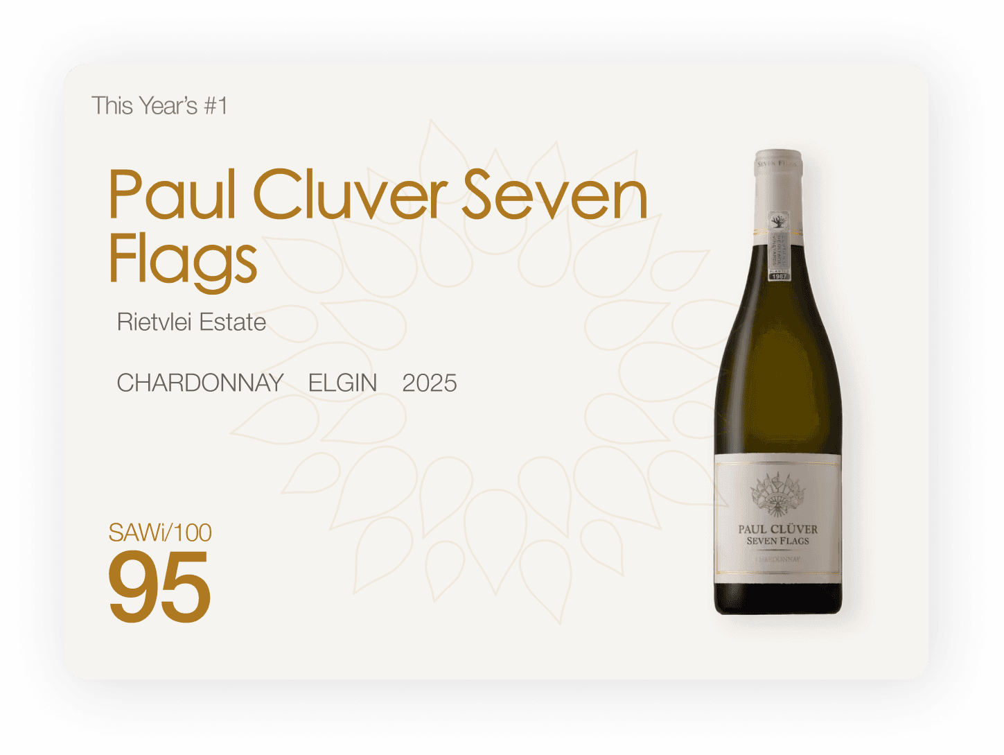
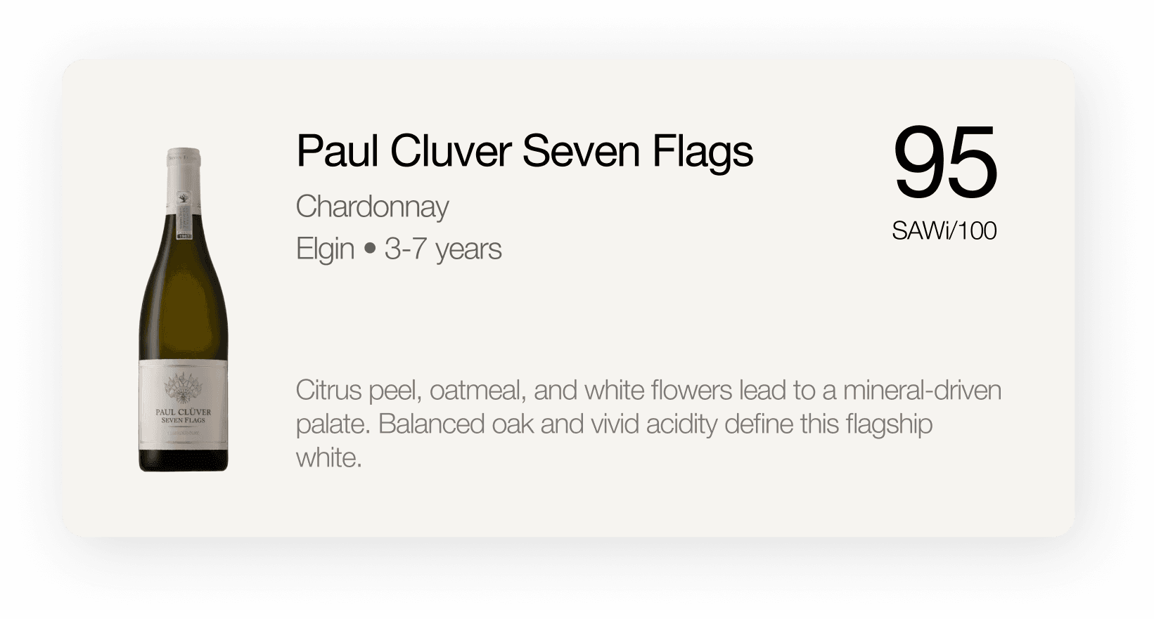
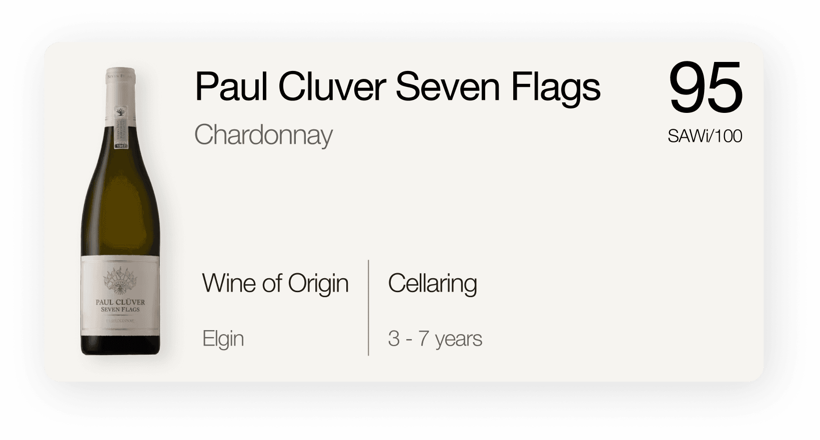
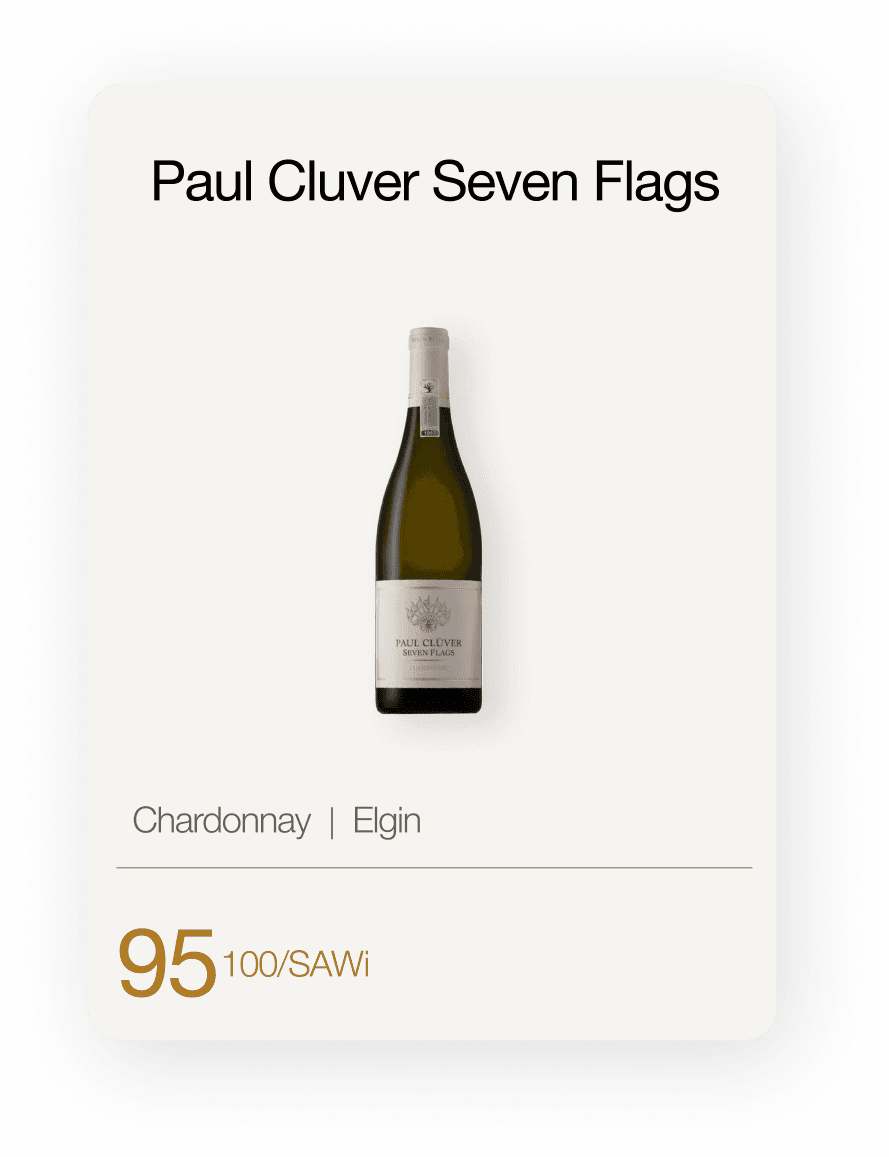
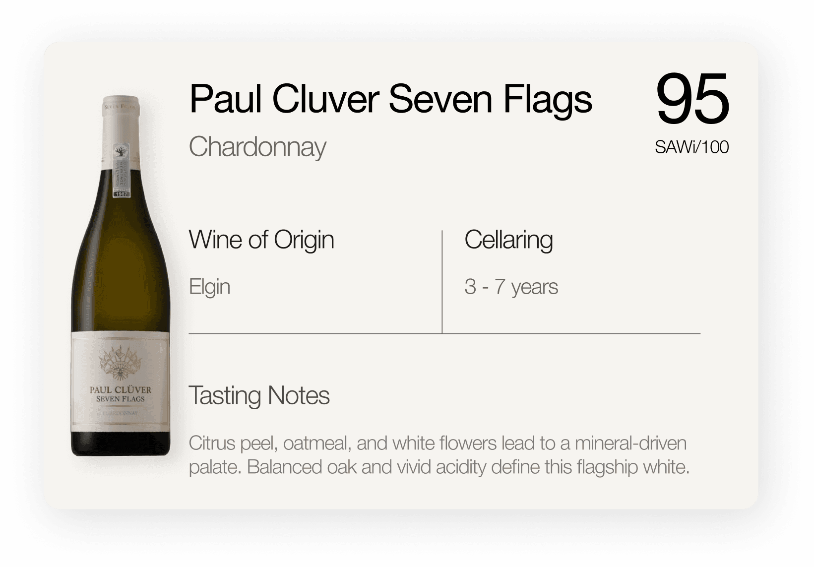
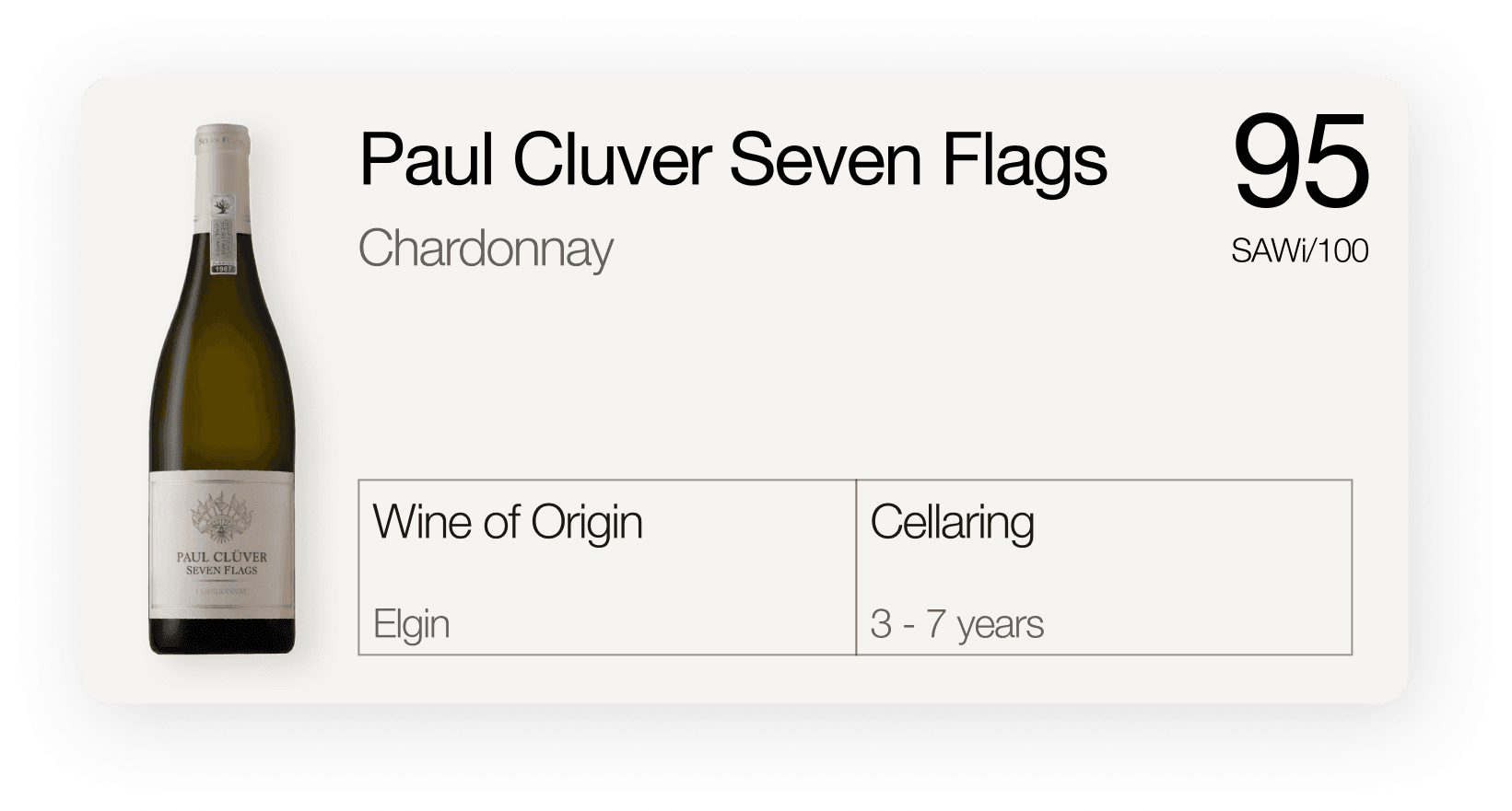
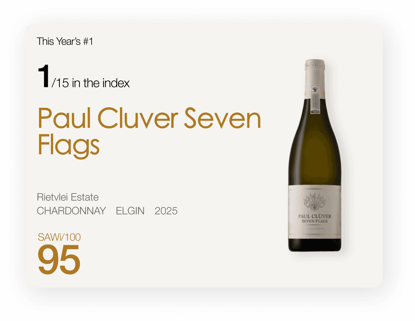
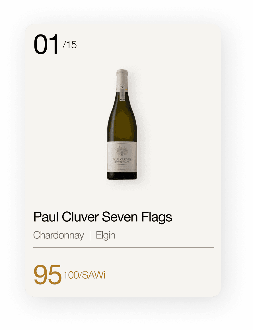
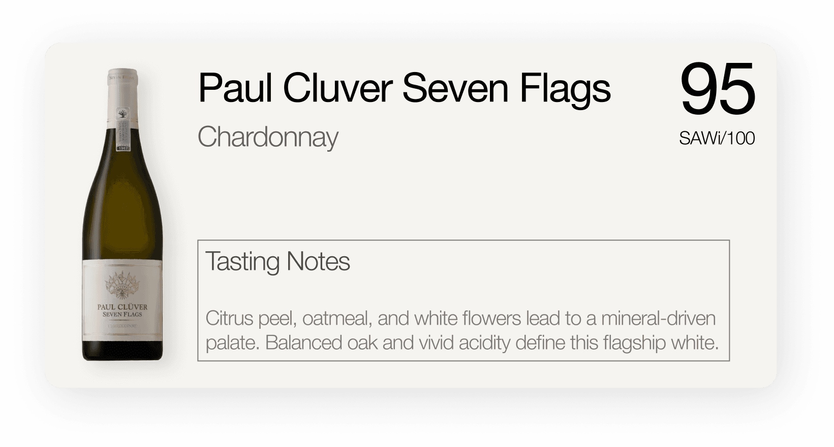
A selection of the many card and list variations, reworked until the list read as a record.
09 / Design decisions
Four design decisions, all solving the same problem: don't look like a shop.
How the score is written, how the seal is used, how a wine opens, and what a winery's entry shows. Each one is structural.
01 The score, and the seal
The score is always tied to /100 SAWi. That binding makes it read as a measurement. There are no prices anywhere in the product to confuse it with.
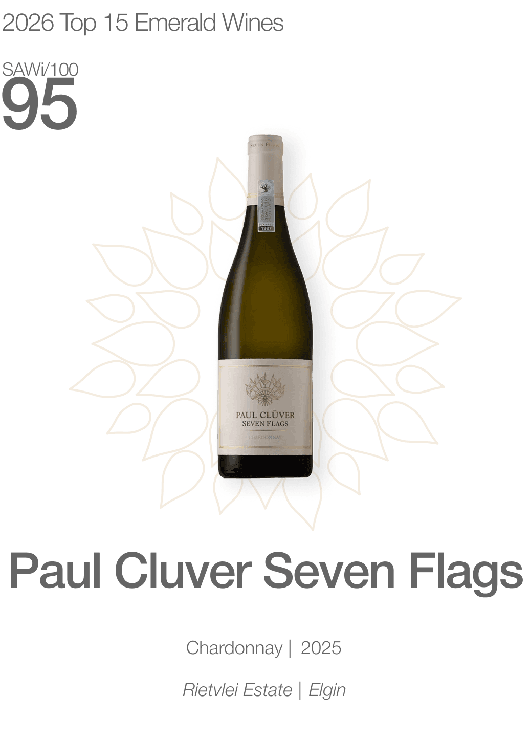
Top 15, mobile
The seal is the hero of the card. The petal-medallion frames each bottle as honoured.
02 The card expands in place
A separate page per wine reads like a product listing.
A wine still has to carry enough to decide on: cultivar, vintage, region, cellaring, tasting notes. So the card opens where it sits. The bottle enlarges enough to read the label, the rest unfolds under it, and you never leave the index. Grid and list are two densities of the same object, and both expand to the identical state. The view is a preference. The wine behaves the same either way.
Card expanding in place
03 The seal record
Inside a winery's entry, the score doubles as the seal record.
Every wine shows its score and which seal it earned, if any. Gold and Platinum carry the petal medallion behind the number, in the metal they earned. Anything under the threshold says so plainly and gets no medallion. The seal is the only commercial object in SAWi, and this is the one place it surfaces. It appears as an outcome of the score.
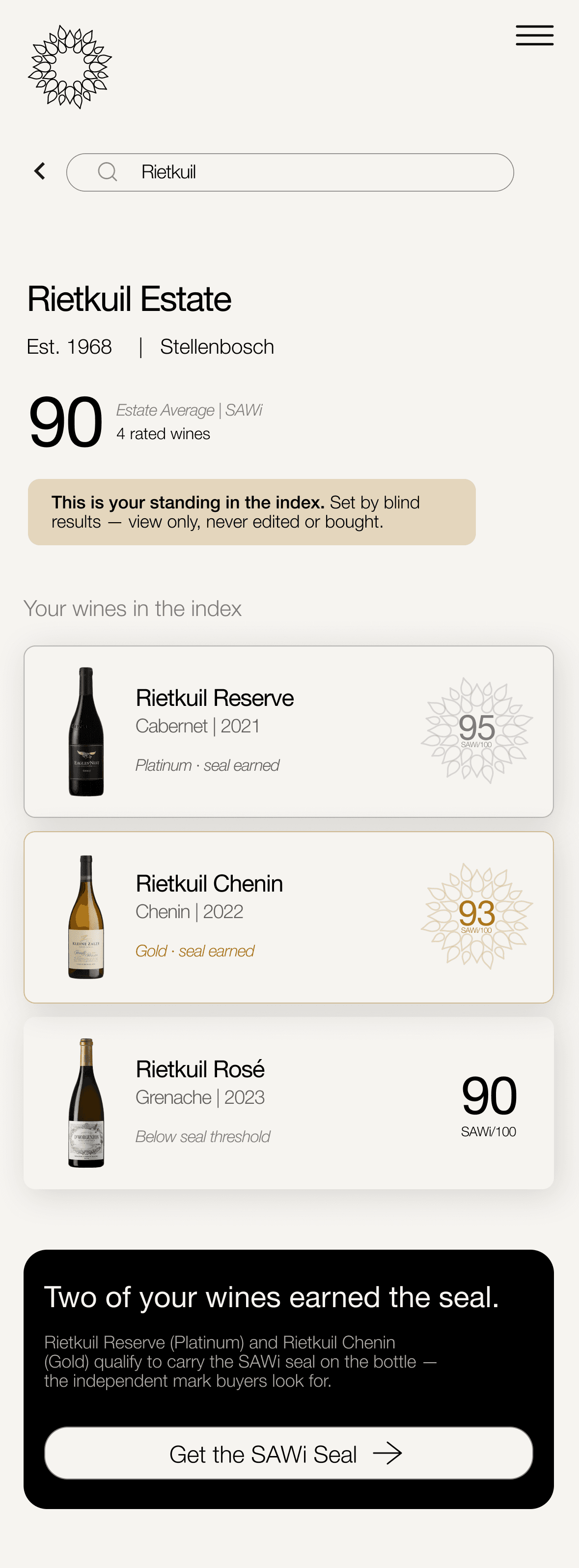
Winery entry, seal record
04 Two paths, unequal room
Drinkers and farms both get a path, but they don't get the same amount of room.
Consumer path
The consumer path leads, because it's the volume audience and the proof of SAWi's value. Browse, search, discover by region.
Farm path
The farm path sits directly below it, visually distinct and impossible to miss. It is read-only: you can see your score, but you cannot edit it and nobody can pay to change it.
10 / The outcome
SAWi now reads as an independent data instrument, not a wine shop.
The data leads. The methodology is visible. The two audiences — consumers and farms — each have a clear path in.
View the click-through prototype
11 / What I learned
The “not a shop” constraint drove most of the good decisions.
The score format, the expand mechanism, the seal treatment, the absent cart — all came from that one line in the brief.
The part I'd hold loosely is the ranking read. The numberless Top 15 reads as considered. I haven't watched anyone confirm that.
12 / What's next
Three things I'd test or build before I'd call this finished.
N1
Put it in front of real people
Test the two claims I can’t prove from the inside: that a visitor knows within seconds which path is theirs, and that the numberless Top 15 reads as ranked.
N2
Give the methodology room to breathe
Credibility is the whole product, so transparency deserves its own browsable surface. Show the working.
N3
Make the data move
Animated charts for the multi-vintage score, the weighting, and regional share, so five vintages of a wine read as a shape.